
I’ve seen this tweet – and variations on it – many times in the past few weeks. It shows that global temperatures “remain well within the range that climate models project”. There’s now an article on the climate brink that goes over similar ground. And RealClimate has a perennial post on model-obs comparisons.
On the face of it, it looks not to be the case that observations remain within the limits of model projections; the red line showing the observations peeks out of the blue shaded area. However, we might expect that to happen from time to time. The blue shaded area is only the 5th-95th percentile. If we make certain simple assumptions – wrong ones, it must be said – then we might expect the red line to stick outside of the blue area one month in ten, or thereabouts. i.e. slightly more often than once a year. Whether it does that isn’t easy to see. If we make more realistic assumptions then there’s no way to tell easily by eye whether red line and blue shaded area are in any sense consistent.
This is a general problem with plots like this and uncertainty ranges, particularly with the comparisons they invite us to make. The way the plot is constructed, we can maybe say something about each time point individually, but very little about them collectively without doing further calculation. There are strict limits to what most people can get from this graph by mere eyeballing. This doesn’t stop them of course. The very form of the graph, which shows time on the x-axis and temperature on the y-axis invites us to think that we can make comparisons across time, but it’s not that easy.
One problem is that the series are all temporally correlated. If the red line is high in one month, it’s more likely to be high again the next. If it’s outside the blue limit in one month, then it’s more likely to be outside it the next. We have to account for that when thinking about consistency. We also have to bear in mind that the blue shaded area is made up of a bunch of models that each have different behaviour.
Indeed, the blue shaded area represents a whole mess of stuff. The spread comes from different runs from different climate models in the CMIP6 archive. So it reflects differences in long-term trend – different models have different rates of warming – and from variability around the long-term changes. Each model will have a different spectrum of variability with different magnitudes etc.
This all makes the blue shaded area a very broad target. It’s entirely possible that the red line could fit within the blue range and not look like any of the models at all. If the red line looked like the black line, for example, it would be well within the model range, but not look at all like any of the models. The real problem is the inverse of that and even harder to analyse: do the models resemble the real world? There’s no way to tell because all we have are the 5-95% boundaries. Around 1998, the red line is at the upper edge of the blue area, around 2008 it reaches the lower edge. Do any of the models do something like that? What about 2023’s weird spike in temperature? Again and again, we can’t say based on this plot.
A follow up tweet shows trends over different periods and tells another part of the story.
We can see that the long-term trend sits at the lower end of the model envelope towards the left of the graph, but closer to the middle on the right albeit still in the lower half1. The portion on the left is more sensitive to variation in long-term trends in the models, and the portion on the right is sensitive to combination of long-term trends and shorter term variability as well as observational uncertainty. To what extent are the right and left sides correlated? It’s hard to say. These are all trends that end in 2023. If 2023 goes up, the observed lines go up, but by more on the right than the left.
Inevitably, these plots only tell part of the story and each one is part of a broader assessment, some of which you might find in Zeke’s other tweets, and also more broadly in climate science. It’s important to remember that we can’t rely on a single graph to tell us the whole story. Graphs like these summarise a whole bunch of information, but a summary necessarily leaves stuff out.
I was reminded of how much can be left out by the release of “Climate The Movie2” which is a masterclass in misleading with graphs and leaving out crucial information. For example, this doozy.
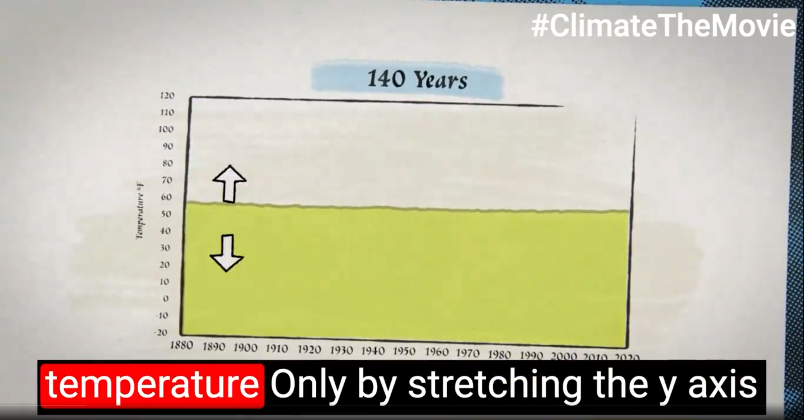
Not only is the y-axis on the global temperature series stretched to a ridiculous range, rendering the series almost horizontal, but the entire plot is rotated clockwise by a few degrees so that any residual discernible trend is reversed.
The movie also shows a rehash of John Christy’s infamous model-obs comparison, which hides many of the things that Zeke’s plot shows – it averages all the models together in odd groupings, it averages all the satellite and balloon observations together, the chosen baseline is deeply weird and involves matching trends in a particular year, etc – and is used to make the opposite point to the one Zeke made: claiming to show that models and obs disagree.
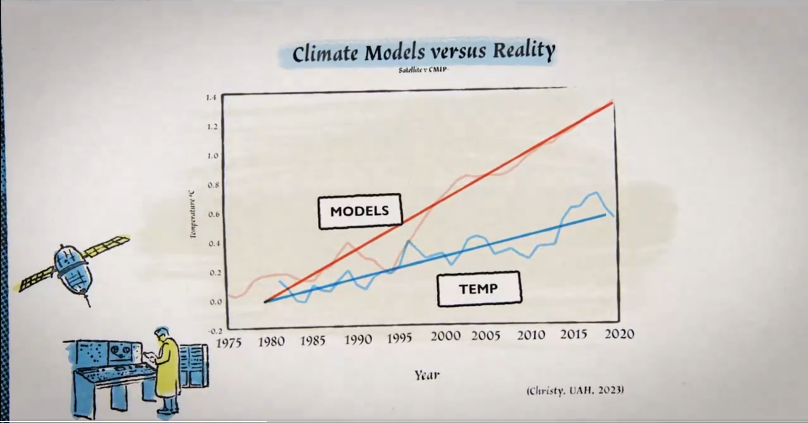
Christy’s is a truly crappy plot, and its many weaknesses have been well enumerated in this great video, but by removing almost all the important information it’s a particularly clear reminder that no graph like that can show everything.
A basic graph, in a very simple situation (e.g. an undergraduate lab class), might be able to show all the data, but very few graphs in the real world are that easy, particularly not one purporting to show that global mean temperatures and climate models and observations are doing the same thing (or not) or indeed that either one conforms to “reality”. That’s a vastly more complicated question.
When confronted with a graph, it can be helpful to ask not just what it shows and what it leaves out, but also what can and can’t be inferred from it and why.

Leave a comment