
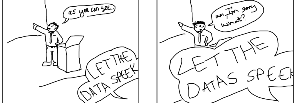
There is a view that scientists should deal in facts and facts only1. As if the everyday work of a scientist were to diligently mine nuggets of truth, which could then be assembled like Lego into scientific theories. Possibly. It’s hard to know what someone means when they say something like “just give me facts” or “let the data speak for themselves”.
Data don’t speak. You can stare at them for hours, days, weeks even and they won’t say a bloody thing. I know I’ve done it. It’s a silly bit of anthropomorphism. Data are in the end just numbers. On their own, those numbers don’t mean a thing. If you don’t believe me, here are some data that I scribbled on a post-it note on my desk:
117, 137, 107, 102
They’re not especially eloquent are they? If I tell you the units – minutes, in this case – you can perhaps start to guess what they mean. If, on the other hand, I told you they were temperatures in Fahrenheit, those guesses would be quite different. Even in this simple case, your guesses are clearly bringing something to the data that is not inherent in a mere string of numbers. It’s natural to try and fit meaning to them.
As you might have guessed already, they’re the lengths of films. Those four films are:
Alien, Aliens, Predator and Robocop.
Which leads us onto the next question: why2? Why do you have the lengths of those four films written down John? Well, we wanted to know which of the four films was shortest so that we could watch one and get to bed early.
We’re starting to build a picture around these data – what do the numbers represent? why were they gathered? what question was I trying to answer? and so on – and those questions beget others. Why those four films? Why not others? Where did you get the numbers from? Is it the length of the director’s cut or the original theatrical release3? How many minutes of FBI warnings, production company idents and short films about piracy did you have to watch first? Which film did you watch in the end4?
None of that is there in those four numbers, but once we start to build a framework around them, those four numbers can start to mean an awful lot (it can feel that way anyway), and this is just a very simple example5.
In science there is a lot of data. If it could speak, it would… well, it would probably be an overpowering babble, a clamour that would knock you flat and make your hair unmanageable. But it can’t speak. If we want to get meaning out of data, we can only do so by trying to understand it in some kind of framework, or (more usually) a lot of different frameworks. Often, you’re looking for a story or framework that fits the facts and, sometimes, you can find one (or several), or you have a bendy enough story to fit whatever facts there are. In this sense, science is just an extension of what we do naturally. Earlier on, when presented with those numbers, you started trying to guess what they meant. Your brain is quite good at coming up with different stories, and theories about them. If they don’t match straight away, you come up with others.
But science is also different. Scientific theories have a tendency to be more quantitative, though it’s not always or necessarily the case. Second, finding a story that fits the facts is only the first step. No matter how difficult it was to find a decent theory that matches all the facts, the next step is the really difficult one. You take the story or theory you have and play “what if?” What if we raise the temperature by 10 degrees? What happens if you spin it the other way? What if we feed them after midnight? If you have a good theory it will be able to tell you what happens when you conduct that what-if experiment. If you then conduct that experiment, the results – ultimately the data – will tell you whether the theory is wrong or not wrong6. In that sense, at least, the data have the final word.
–
When someone says that we should just “show the facts” or “let the data speak for themselves”, what they mean isn’t clear. On the one hand, they might think that the data present such a clear picture that it should be obvious what they mean, but that’s simplistic thinking on their part and betrays a misunderstanding of the role data play in science. Alternatively, they might want to deceive you by making it seem simpler than it is. Either way, it’s not the data speaking; it’s some kind of tragic ventriloquism. The ventriloquist is putting their words and their theories in the mouth of the data.
The most common example of this is someone waving a graph at you and saying, what about this then? as if it clinches the argument. A graph is just data summarised. If it means anything, that meaning arises in the context of that person’s understanding and your own. Those two points of view may differ as to the meaning of the data and that’s fine (although you wouldn’t be able to tell that from twitter).
While this happens all over twitter several hundred thousand times an hour, it also happens in the places you’d least expect it, fore example, the Proceedings of the Royal Society. In a recent paper appearing in those august pages, we find this sentence:
“By letting the geophysical records speak for themselves, with the help of our original methodology, we discovered a regularity that apparently contradicts common opinion.”
That the data can’t speak for themselves is betrayed by the qualifying clause “with the help of our original methodology“, but we are nonetheless left with the impression that the data themselves contradict “common opinion“, rather than simply supporting an alternative explanation as well. In this case, the regularity they claim to have discovered is that temperature drives the amount of carbon dioxide in the atmosphere and not vice versa. “Common opinion” is that it’s considerably more complicated than that.
To unpick who is right, we need to look at the theory and how it compares to “common opinion“, which I take to mean, the current best theories (multiple, note; there is room for disagreement on such things) about the relationship between temperature and carbon dioxide. On the side of the paper, they have found a particular mathematical relationship between timeseries of data representing atmospheric temperature and timeseries representing atmospheric carbon dioxide levels. That’s it. They’ve simplified the whole problem down to a simple mathematical exercise. While their paper provides a framework for understanding those data, it is a very simple and limited one and doesn’t explain anything else
“Common opinion“, on the other hand, can explain a much wider and richer range of data. It explains changes in the ratios of different isotopes of carbon in the atmosphere. It explains the drop in oxygen in the atmosphere that has been consumed by the burning of fossil fuels. It helps to understand how all the sources and sinks of carbon fit together via carbon budgets and how the amount of carbon in the ocean and land sinks can be going up at the same time as atmospheric concentrations are. And, most importantly, it explains where the billions of tonnes of carbon that humans have burned over the past two centuries have gone. It also explains the very limited relationships found in this new paper as part of a more encompassing whole.
Now, should we dismiss the new findings out of hand? No. Should we take them seriously? Yes, but also: no. Every new theory started off small and should be treated fairly7, which is to say seriously, but if a theory has anything going for it, it doesn’t lack for different ways it can be tested. The paper presents an analysis that, as yet, explains a tiny amount of data. There’s a world of data out there that it still has to explain before if comes anywhere close to having the explanatory and predictive power of what they term “common opinion“.
It’s notable that others have advanced similar theories that run counter to “common opinion”, and that the authors have made the same finding in earlier papers. That the theory has not really advanced since the last time we saw it, is a sign that perhaps there’s nothing there to see and all that is to be learned from this framework – at least as far as temperature and carbon dioxide go – is how it went wrong, but we’ll have to wait and see. But perhaps not for very long.
-fin-
- Hard Times was the first Dickens book I read. I have seldom fallen so quickly or completely under an author’s spell. ↩︎
- Why have you got *that* on your desk John, is a question I have been asked numerous times in the past. There’s isn’t always a good explanation. And I find the implication that there ought to be one kinda hurtful. ↩︎
- In the case of Alien, it was the original theatrical release, but it turned out that we had both versions on the DVD. ↩︎
- Elvis, but then fell asleep after 90 minutes. I know – Elvis was not on the list – but data are rarely complete. ↩︎
- Like choosing what film to watch is ever simple. Ha. ↩︎
- This is not the same thing as right. It just means we don’t know for sure that it’s wrong. ↩︎
- Out of self preservation – you know never know how big a theory’s going to get. ↩︎

Leave a comment